CRO for High-Growth, Performance-Obsessed Teams
We don't run shallow tests just to say we tested.
We design high-leverage, hybrid experiments that combine deep strategic insight with standout execution – so you get conversion lifts that actually last.
Our approach blends data-backed analysis, creative experimentation, and a sharp eye on long-term upside.
No fluff. No wasted traffic. Just smarter testing that compounds.
Our
Toolkit
Trusted by:


Traditional CRO is broken.
We're rebuilding it.
"My site feels like it's taped together with random widgets."
"We don't have a cohesive story throughout our site."
"My designers & devs don't think like performance marketers."
"The testing ideas feel uncreative."
Most CRO agencies focus on running fast tests for the sake of volume. The problem? That rarely compounds into meaningful growth.
At BedaBeda Growth, we take a hybrid approach: blending the best of traditional CRO, deep strategic insight, and "big swing" psychological & storytelling experimentation. The result? Bigger wins, clearer signals, and long-term upside you can actually build on.
We're not chasing dashboard dollars. We're chasing real dollars.
Our Difference?
Data Deep-Dives + Bespoke Conversion Strategy
We believe: to optimize behavior, you must optimize perception.
Craft a completely custom user journey
Every design choice is intentional and based on your specific user data and business goals.
Test, analyze, iterate & win
We use a systematic approach to continuously improve your conversion rates through data-driven testing.
Build site perception & value
Our process strengthens your site value, while driving real performance results.
Give your site a once-over
Generic advice that doesn't account for your unique audience, industry, or business model.
Quickly exhaust their list of best practices
Test ideas feel stale quickly, risky tests are rolled out, and important data-based considerations are missed.
Provide no long-term growth planning
Lack of innovation and strategy means no long-term competitive thinking - just short-term tactics that create a patchwork site decreasing in value.

Craft a completely custom user journey
Every design choice is intentional and based on your specific user data and business goals.
Test, analyze, iterate & win
We use a systematic approach to continuously improve your conversion rates through data-driven testing.
Build site perception & value
Our process strengthens your site value, while driving real performance results.
Ecommerce & High-Volume B2C =
Our Sweet Spot
We've driven powerful, measurable lifts for:



E-commerce brands between $10M–$150M
Scaling beyond basic DTC playbooks


High-volume B2C services
Security, education, health sectors


Subscription & B2C SaaS businesses
With growth bottlenecks to unlock
The decision to work with this team has provided an exponential ROI.
"Working with BedaBeda Growth has brought immeasurable value to our business. Their copywriting and conversion rate optimization services significantly lowered our CPA in a very competitive market. Although BedaBeda Growth isn't cheap, they are extremely efficient and the decision to work with this team has provided an exponential ROI."
Jon Klein
CEO
Neutralyze
What's their common thread? They're past the "best practices" playbook stage. They're ready for depth, not fluff. And they're tired of CRO that doesn't move the needle or leaves their site looking like Frankenstein's love child.
When You Mix Psychology & Data, Great Things Happen
Average of 23% Increase in Revenue Per Visitor in First 5 Months
Huge increases in conversion rates and AOV (ultimately RPV) mean huge boosts in overall performance, making your acquisition spend way more efficient and impacting your top & bottom line quickly.
Better Customer Retention + More New Customers
With customized user journeys for your specific customers, you'll learn which levers actually move the needle + expand your new customer sales while doubling down on returning customers.
Pave The Way For Profitable Future Growth
Not only are you receiving critical insights to optimize your entire customer journey, but high performance pages allow you to drop your acquisition costs, giving you more budget to keep growing & protecting your margins.
Case Studies & Portfolio
Browse Some of Our Wins

E-commerce
+15.8% Revenue Per Session

Product Page Optimization
Data-driven PDP overhaul for niche home goods
Landing Page
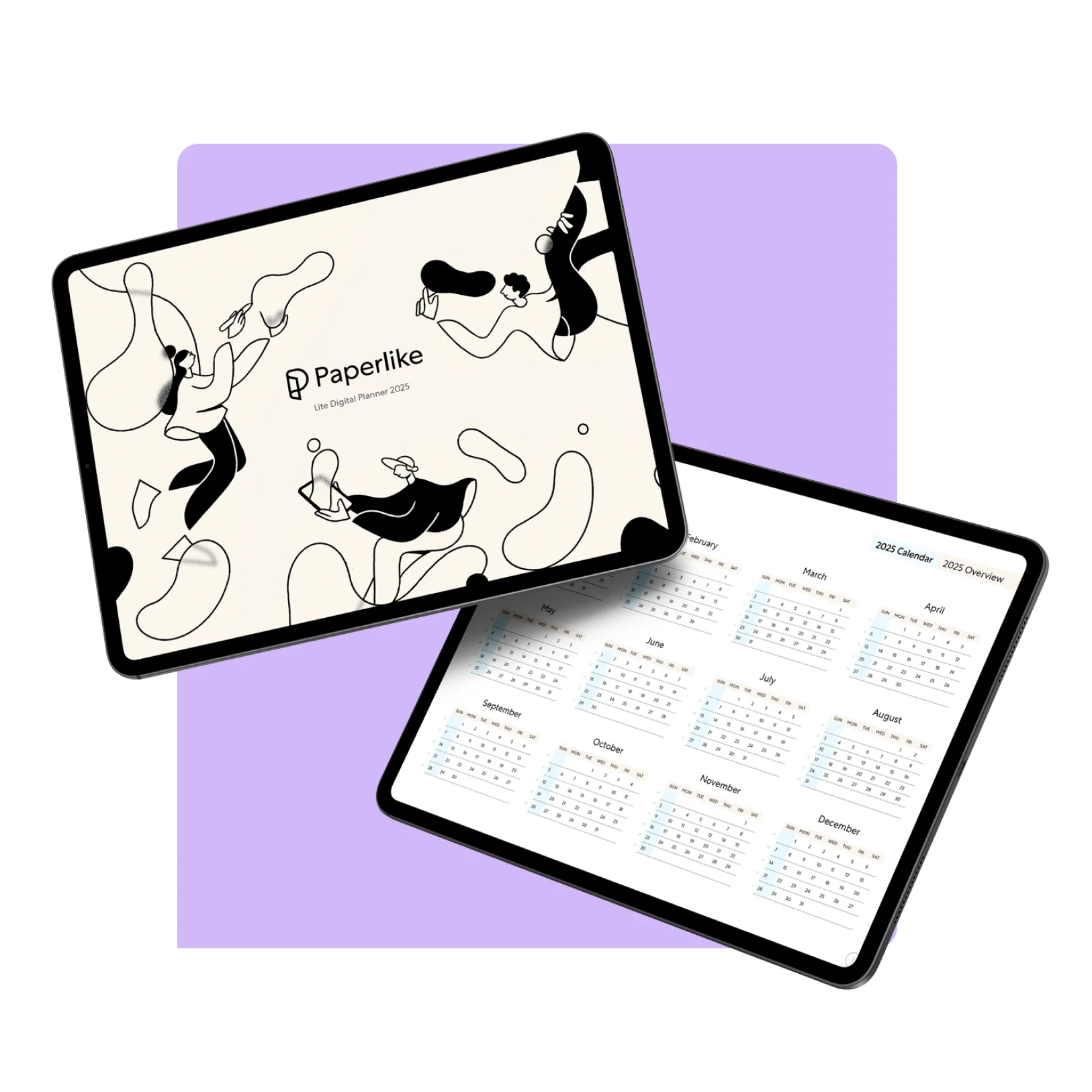
+57.4% Conversion Rate Increase

Landing Page Optimization
Ad-focused dedicated landing page
Online B2C Community
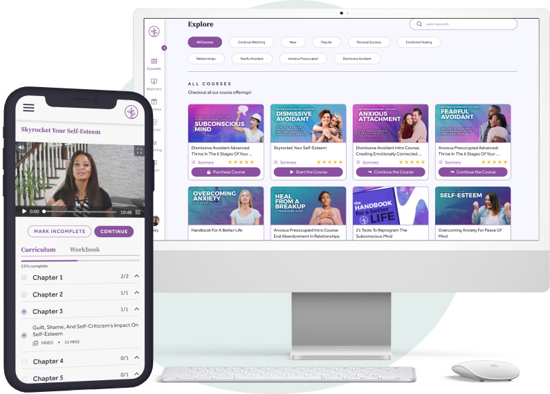
+36.3% Revenue Per Session

Homepage Optimization
Homepage optimization for high-volume B2C online community

High SKU E-Commerce
+$1.8MM New Annual Revenue

Catalog Page Optimization
Catalog/Collections page optimization for 9-figure brand

Landing Page
+95.6% ROAS Increase
Offer Optimization
Landing page offer optimization for men's care brand
Not an intern. Not a middleman.
Real experts.
We're small by design. You'll work directly with the people who think critically, synthesize qualitative and quantitative insights, and design experiments that actually teach you something.
Strategic Thinking
Deep analysis that uncovers the real conversion barriers hidden in your customer journey.
Flawless Execution
End-to-end test implementation that maintains your brand integrity while maximizing impact.
