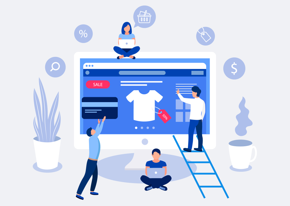
Dedicated landing pages are emerging as an e-commerce superpower in a big way. And while we already know that control is what makes a landing page an outstanding tool for boosting your conversion rate, what you may not know is that there’s a fairly effective formula for securing that optimal level of control.
Knowing that an e-commerce landing page has to guide a customer through a very specific journey is one thing, but actually crafting that journey, in line with where your target audience falls in the ecommerce funnel, is another. That’s why we’ve assembled this list of best practices for effective landing pages that are actually proven to drive conversions. We would know – we’re a little compulsive about testing…
Get rid of external pathways:
Ever noticed how high-converting landing pages don’t usually have navigation links? That’s very intentional. As soon as a visitor’s eyes see a navigation bar, they often want to explore the brand, other products in a collection, etc., totally throwing off their pre-mapped customer journey. And social media links? Even worse.
Even if that Instagram icon links out to your brand’s page, as soon as their phone opens the app, they’ll see their own notifications pop up and…cue 40-minute news feed scroll. Assume that any excess landing page elements/avenues to a different page will be taken, and that it’s your job to (benevolently) block those departures.
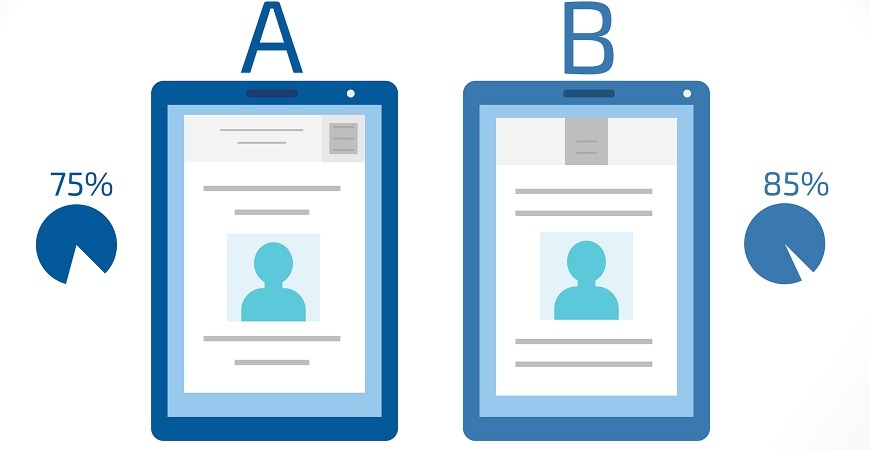
Draw eyes to the Calls to Action:
Contrast contrast contrast. The CTA button/text is the most important part of your landing page, for obvious reasons. So you might be surprised by how many brands fail to draw potential customers’ attention to CTAs. Many fall into the trap of imagining the LP more as a product page, where the “Add to Cart” button is tidy and inconspicuous.
Some very minimal brands may want to give priority to their branded imagery over a text-based CTA section — but that’s the biggest mistake you can make in the world of landing page optimization. Contrast can be as simple as changing button color, but it can’t be underestimated for its ability to guide and control the user journey towards that final purchase.
Reduce clutter, concentrate attention:
Self-explanatory, but highly effective. Remember that all of your landing page content needs to serve a strategic purpose for the landing page visitor, and simple design is preferable. Is that scroller of lifestyle images an essential element, or does it just reinforce the brand nicely? Does that product description keep the primary goal in mind or have too many additional details? Might be worth nixing.
Of course, this doesn’t mean that all landing page design has to be visually minimalist. Brand identity is still a key element, but anything that draws attention away from the carefully mapped buyer journey could be detrimental to conversions. If the aim is to meet a conversion goal, then customer experience has to come first.
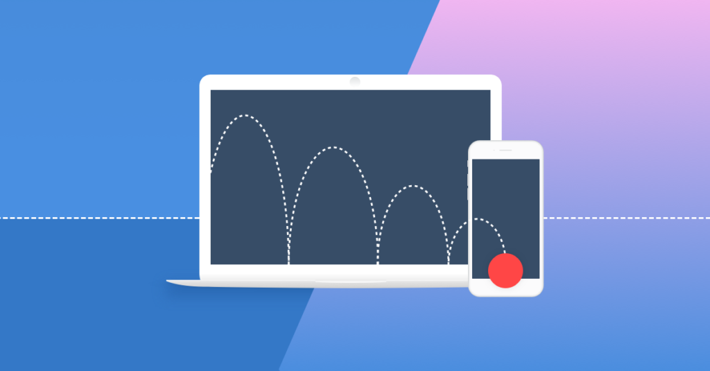
Keep an action button above the fold:
The big hurdle, regardless of where your campaign falls in the sales funnel, is the first few seconds on a page. And the very top of the page — what you see before you ever scroll — is prime real estate. You have limited time to direct their attention to CTAs, first couple seconds determine if someone scrolls down and learns more, or closes the tab all together.
One simple way to improve retention? Keep an action button above the initial fold of the page. Don’t make users scroll down to find an action item for them to complete. If they’re not seeing something they can interact with right away, then the assumption’s often that there’s a lot more text to come, and nothing to hold their attention.
Keep your request simple:
Make the desired action super clear, and keep reinforcing it. In this instance, options won’t help you. Adding “browse the collection” and “learn about our process” buttons to a dedicated LP can spell disaster, as outlined in #1.
Instead, stick to one action: “Add to Cart”/”Try xyz”/”Get xyz” and make each of those buttons a direct pathway to checkout. Reduce friction, guide users toward a purchase desicions, and turn those clicks into conversions.
Carefully test video – always:
Disclaimer: despite popular belief, we’ve found that videos can interrupt the flow of the buyer journey. They stop to watch, they may open another tab in the meantime, the video is long and reminds them of something else & they get distracted, clicking may make the video launch on YouTube/Vimeo/etc.., or worst of all, an ad may appear in the video (depending on the platform)…
Instead, gifs and simple infographics can be a great alternative if a product is particularly tricky to describe. Again, we’ve seen video work horribly and video work very well (when the target audience relies heavily on YouTube reviews in their buying decision, for example), but in many cases, when you feel the urge to include a video on a dedicated LP, it’s well worth committing to test & carefully monitoring – and then asking if that info can be conveyed with a simpler visual.
Build in testing opportunities:
Mapping out a new landing page, but stuck on whether to include one type of product photo versus another? Save one and test it later. The best way to overcome uncertainty is to test, because the live data won’t lie.
As long as you have a plan for what you want to measure (i.e. “will moving the product benefits section down the page lead to a higher bounce rate?”) and clear justification for it, noting these testing opportunities is a great way to further grow your conversion rate well after your landing page first goes live.
Want more expert conversion rate optimization insights?