For DTC ecommerce operators, there’s been a lot of debate & advice lately that “about” or “our story” type of content doesn’t matter for ecomm sites and performance.
This advice is coming from some gurus, sure, but it’s also coming from those who have been in the ecommerce game for many years – and have been pretty successful at it.
But here’s the common theme with those who are saying this: they’ve never tested it.
Similarly to a lot of ‘best practice’-style advice, it just doesn’t mean much.
And why should you listen to me? Well, my team and I at BedaBeda Growth (who specialize in CRO) decided to go ahead and test it.
Spoiler: It added 6-figures of NEW annual revenue for our partner.
Let’s Talk About Proof, Baby
Here’s… ‘our story’ 😉
First, this was not a one-hit wonder type of test like you see a lot of plastered all over the internet (falsely).
We tested a few things previously: better user interface on the product page, better highlights on benefits and values to the customer, stronger conversion copy, more appealing designs, stronger call-outs to the savings/offer, etc.
We got negligible lifts in performance. But we were looking for gold, not copper.
So, we kept digging into the data.
If you ever work with a great CRO team, you’ll know that the research is 85% of it.
It’s NOT a series of ‘hacks’ and best practice guesses.
And after a whole lot of analyzing, we found something very interesting…

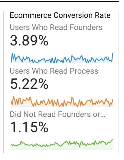
We uncovered that users on their site that read the ‘Founders’ page and/or the ‘Process’ page converted *significantly* higher vs. those who did not.
Check out the comparison in the image above. Those metrics are something to be pretty intrigued by.
Obviously volume plays a role – but it’s a great positive indicator.
We decided we needed to test the impact of putting that Founder/Process story information in front of people on the actual product pages, where purchasing actions were happening.
The Proof is in the Pudding
We created a new version of the flagship product page that blended in the most compelling and engaged with pieces of the ‘Founders’ story & the ‘Process’.
(How did we zero in on what info to include? By using heat maps & video recordings! We always pair our quantitative analytics & analysis with qualitative analytics & analysis so we are getting as many valuable inputs as possible.)
With spending so much time reviewing video recordings of user behavior, we noticed another frequent pattern on the existing product pages.
The vast majority of users were checking out the product specs in the hero (very typical), then they were scrolling down past the supporting info of benefits, features, etc.
Instead of chronologically consuming information, they were going straight to the reviews, and then scrolling back up to the supporting information sections.
Thanks to this clear, more full picture of the user journey, we decided to also make a second variant of the updated product page which placed the reviews carousel above all of the supporting founders/process information.
Results Say… Your Story Matters. In a Big Way.
Contrary to popular belief from the advice of the gurus and even those best-practice loving experts, we found that both versions of the product page that featured the founders’ story/process performed better than the control.
Both versions also provided higher AOV & per session value.
These results were statistically significant at 97% and the new product page is adding over +$138,600 in NEW annual revenue.


After seeing these results, it’s pretty clear that many DTC brands are likely leaving a lot on the table. Especially those listening to folks who have never tested their theories.
Use your story to help your customers understand & trust you. They value the effort you put in behind the scenes, so be proud and let them know why their purchase is worth it.

